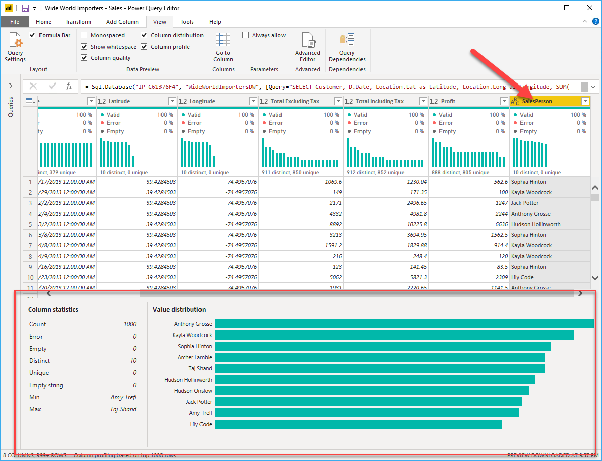
Data profiling involves a detailed examination of data intricacies, including anomaly detection, exploration of underlying data structures, and analysis of data statistics like row counts, value distributions, minimum and maximum values, averages, etc. This practice is crucial as it enables the organization and shaping of data, simplifying interaction and facilitating a clear understanding of data distribution. Consequently, this aids in streamlining the process of working with data on the front end, making the development of report elements significantly more effortless.
In the context of creating reports for the Sales team, where the data structure is uncertain, conducting data profiling in Power BI becomes essential. Power BI offers built-in features that seamlessly allow users to perform these tasks behind the scenes, ensuring a user-friendly and straightforward process.
Examine data structures
Before you begin examining the data in Power Query Editor, you should first learn about the underlying data structures that data is organized in. You can view the current semantic model under the Model tab on Power BI Desktop.

Within the Model tab, you have the ability to modify individual column and table characteristics by choosing specific tables or columns. The transformation of data can be accomplished through the utilization of the Transform Data button, leading you to the Power Query Editor. Furthermore, you can oversee, establish, modify, and remove relationships across diverse tables using the Manage Relationships feature found on the ribbon.
Find data anomalies and data statistics
Once you establish a connection to a data source and proceed to Transform Data, Power Query Editor becomes accessible. Here, you can identify anomalies, which are deviations from the typical data pattern. Recognizing these anomalies aids in understanding the standard distribution of your data and pinpointing specific data points that may require further investigation. The determination of data anomalies in Power Query Editor is facilitated through the Column Distribution feature.
Navigate to the View tab on the ribbon, and within Data Preview, several options are available. For insights into data anomalies and statistics, opt for the Column Distribution, Column Quality, and Column Profile features. The associated statistics are displayed in the figures.
Graphs illustrating Column Quality and Column Distribution are positioned above the data columns. Column Quality provides the percentage breakdown of valid, erroneous, and empty data. Ideally, you aim for 100 percent validity in your data.

The column distribution provides insights into how data is spread across a column, indicating the counts of distinct and unique values. Distinct values encompass all diverse entries in a column, encompassing duplicates and null values. On the other hand, unique values exclude duplicates and nulls. In the context of this table, the term "distinct" denotes the overall count of present values, including duplicates, while "unique" signifies the count of values that occur only once.
The column profile feature offers a detailed analysis of column statistics based on the initial 1,000 rows of data. It furnishes various metrics, including row count, crucial for validating data import success. For instance, if the original database had 100 rows, the row count verifies accurate import. Additionally, this count highlights Power BI-identified outliers, empty rows, and strings, along with providing minimum and maximum values, indicating the column's smallest and largest values, respectively. This distinction is particularly vital for numeric data, promptly signaling if the maximum value surpasses the defined business limit. Such insights draw attention to specific data points, allowing focused exploration. In cases involving text columns, the minimum value corresponds to the first value, and the maximum value corresponds to the last value in alphabetical order.
Furthermore, the Value distribution chart provides a tally of occurrences for each unique value in a specific column. In the depicted graph, it's evident that "Anthony Gross" dominates the SalesPerson column, while "Lily Code" is the least frequent. This insight is crucial for outlier detection; when a value significantly deviates from others, the Value distribution tool aids in pinpointing areas for further investigation.
For numeric columns, Column Statistics encompass the count of zeros and nulls, the column's average and standard deviation, and the count of even and odd values. These metrics offer insights into the data distribution within the column, serving as a valuable summary and initial guide to identifying outliers.
As an illustration, when examining invoice data, the Value distribution chart reveals that certain salespeople in the SalesPerson column exhibit identical frequencies. This pattern is observed not only in the Profit column but also across various tables. Upon investigation, it becomes evident that the utilized data is flawed, necessitating an immediate refresh. The significance of the Value distribution graph becomes apparent as it allows for the prompt identification of errors that might have gone unnoticed without its visual representation.
After finalizing modifications in Power Query Editor and preparing to create visuals, navigate to the Home tab on the Power Query Editor ribbon. Choose Close & Apply, which takes you back to Power BI Desktop, applying any column edits or transformations made.
You have now comprehended the components of profiling data in Power BI, encompassing data loading, examining column properties for clarity and further edits, anomaly detection, and viewing data statistics in Power Query Editor. Armed with this understanding, you can efficiently explore and analyze your data.
SWETA SARANGI
23.02.2024
